
Brand Identity and Website Design for a Pilates Studio
Clear Copper partnered with Valley Studio Pilates and Wellness to deliver a brand identity and website design that feels calm, grounded and intentional. The goal was to create a visual system that reflected both the physical discipline of pilates and the natural beauty of its valley setting—without feeling overworked or overly stylised.
From the outset, the brand needed to translate seamlessly across merchandise, signage and digital touchpoints, while the website had to feel welcoming, intuitive and quietly confident.
The Brief
The initial brief centred on developing a flexible identity system that could scale across physical and digital environments. Key requirements included:
An earthy, natural feel
Clean, unfussy execution
Calm but not bland tone
Strong single-colour performance
Practical use across merchandise and signage
Sage green and light caramel tones were preferred, and merchandise was a major consideration. The logo needed to look just as strong on t-shirts and tote bags as it did on signage or screens.
Exploring the Brand Identity
We explored a wide range of logo structures, including:
Premium emblem-style badges
Standalone monograms
Contained marks for social icons and merchandise
Each concept was tested not just visually, but practically—ensuring consistency and legibility at both small and large scales.
Typography played a critical role in shaping the brand’s personality. Serif styles were explored to strike a balance between elevated studio quality and organic warmth. Some directions leaned classic and established, while others introduced subtle vintage or stylised character, helping refine a tone that felt modern yet human.
Existing pilates brands were reviewed during this phase, with Leeloo influencing early explorations through its organic forms and Grecian-inspired typography. This opened up ideas around large-scale prints for merchandise while staying aligned with the studio’s natural surroundings.
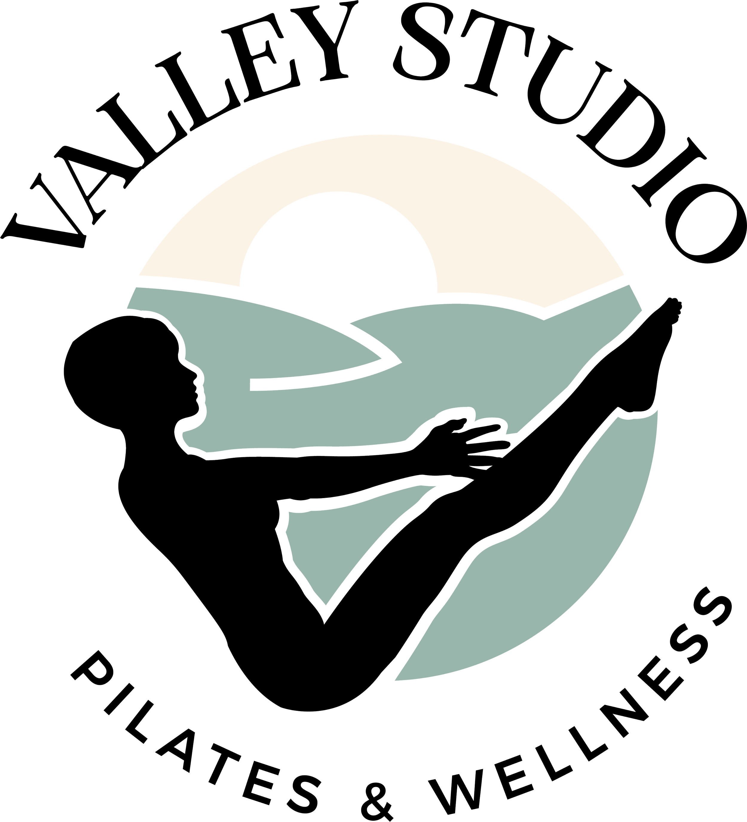
A Shift in Direction
As the project evolved, the client chose to move away from a VS monogram and instead explore pilates poses within the logo itself. This introduced new considerations around movement accuracy, detail and scalability.
We tested multiple approaches, including:
Different pilates poses
Silhouette versus line-work
Varying levels of detail
How the figure interacted with the wordmark
At the same time, we ensured the iconography remained place-based—connecting back to the “Valley” name rather than feeling generic.
The Final Mark
After several rounds of refinement, a strong reference emerged: a pilates pose integrated into a valley form. This concept brought movement, landscape and calm together in a single, simple mark.
The logo was rebuilt and refined in Illustrator, with close attention paid to angles, proportions and micro-details. Every element—from pose alignment to whether the figure held a ball—was carefully considered. The final result reflects that precision and restraint.
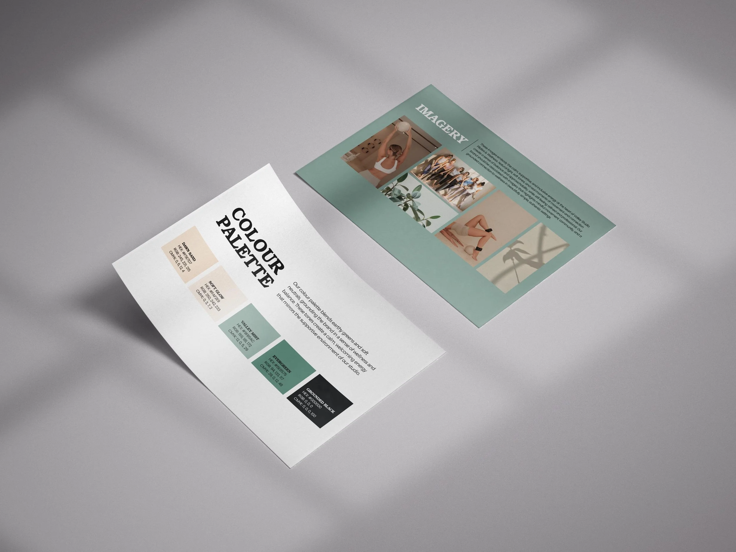
Colour and Typography
The colour palette was designed to feel instantly calm and welcoming:
Dawn Sand and Soft Glow create a warm, clean base
Valley Mist and Evergreen introduce nature without leaning into wellness clichés
Grounded Black adds contrast and confidence
Typography was selected to feel premium without being pretentious. Headings carry presence and credibility, while supporting type remains clean and readable—reinforcing a calm, approachable experience across all touchpoints.

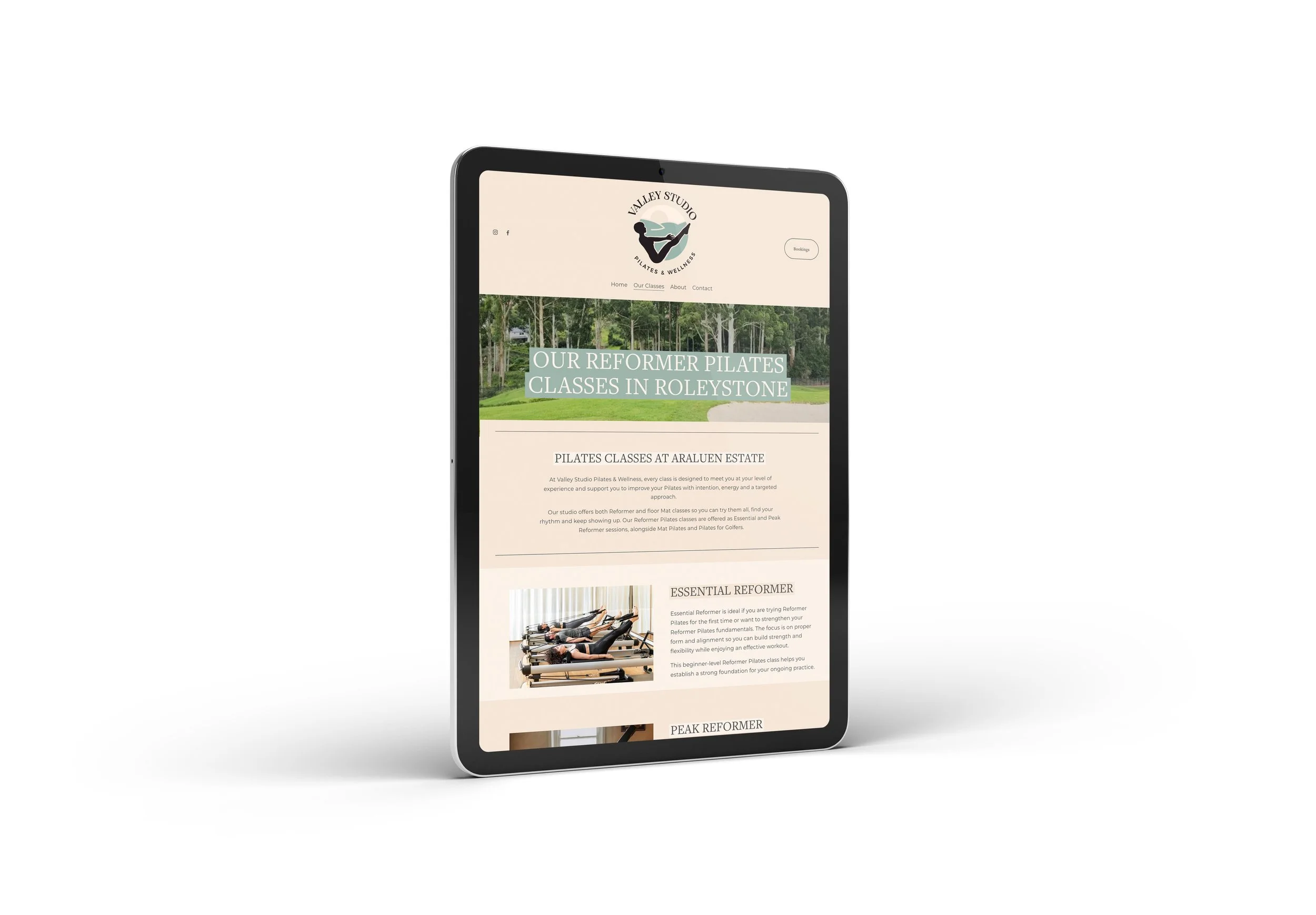
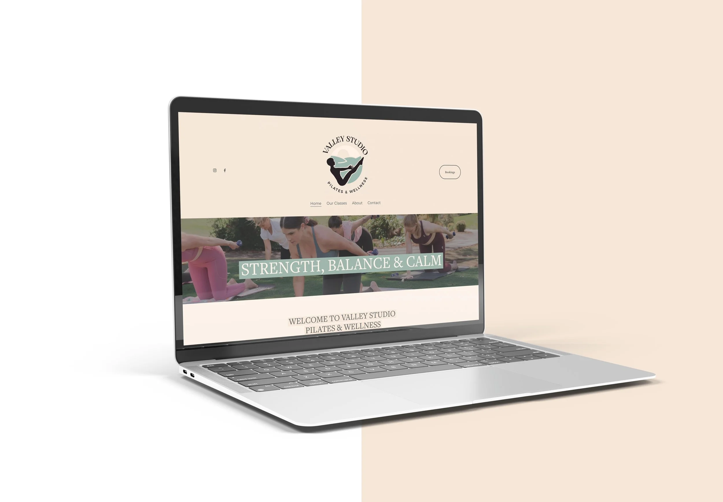
Website Design and Build
Alongside the brand identity, Clear Copper designed and built the Valley Studio Pilates and Wellness website, translating the visual system into a digital space that mirrors the studio experience.
The website focuses on:
Clean layouts with generous white space
Clear visual hierarchy for intuitive navigation
Soft, natural imagery paired with confident typography
A supportive, welcoming tone rather than intensity
The result is a website that creates ease rather than noise—guiding visitors through the studio’s offering while reinforcing trust and professionalism.
View the live website:
https://www.valleystudiopilatesandwellness.com.au
The Outcome
The final brand and website sit comfortably in a soft-yet-strong space. The silhouette and valley elements create a memorable connection between movement and place, while the overall system remains flexible, consistent and practical across touchpoints.
Rolled out across the website, studio environment and merchandise, the brand genuinely reflects the space it represents: calm, supportive, modern and quietly confident.
This project is a strong example of how thoughtful restraint, strong fundamentals and attention to detail can create a brand that feels both elevated and human.